I wanted to make a portfolio and blog site so that I could bring together all my projects and explain the process of making them. I want to show others what I have worked on and provide explanations of challenging parts to serve as an informal learning resource for newer developers and game artists. Two quotes guide the blog section of the website, the first: "if you can't explain it simply, you don't understand it well enough" which is attributed to Albert Einstein, and "the best way to learn is to teach" by Frank Oppenheimer and from these quotes, I aim to make my articles understandable by a non-technical/beginner audience to help others and to improve my own knowledge.
Tech Stack
The current version of the site is built using Astro and builds as a static site for performance and to keep hosting expenses low. It is deployed on Vercel's free plan and since the site is static, it will be cheap (compared to a dynamic site) to host elsewhere. I also chose Astro because it allows me to use a component-based architecture to re-use elements if needed and because Astro can automatically reduce image sizes for performance when building. The downside of my approach is that I have to edit the source code whenever I want to add a blog post rather than using a user-friendly page but this allows me to have complete control over the formatting as it is simply HTML and CSS. Additionally, I use GitLab for version control and I have an automated CI/CD pipeline to deploy the website on Vercel when code is pushed to the main branch.
Iterations
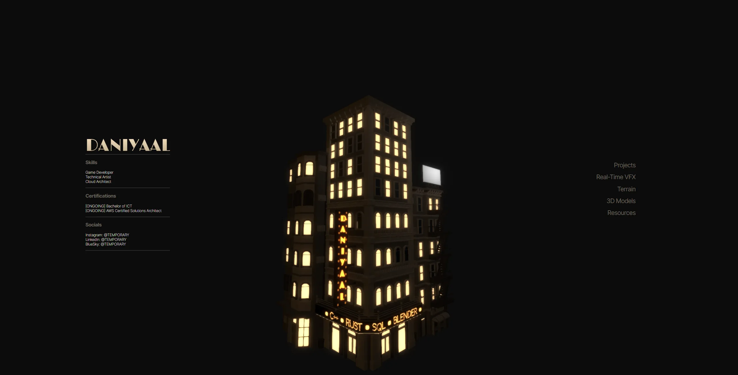
The first design featured a 3D model that was loaded with ThreeJS. The buildings were dynamically lit to simulate the lights of what would be passing traffic and when one of the project links on the right was hovered on, the model would rotate to show the billboard on the right which would change from white to an image relevant to the project being hovered on. Additionally, the front building had a scrolling LED sign to display the technologies I used most. The downside of this design was that the 3D model was too slow to load and that the small size of the billboard relative to the rest of the model made it too small on mobile.
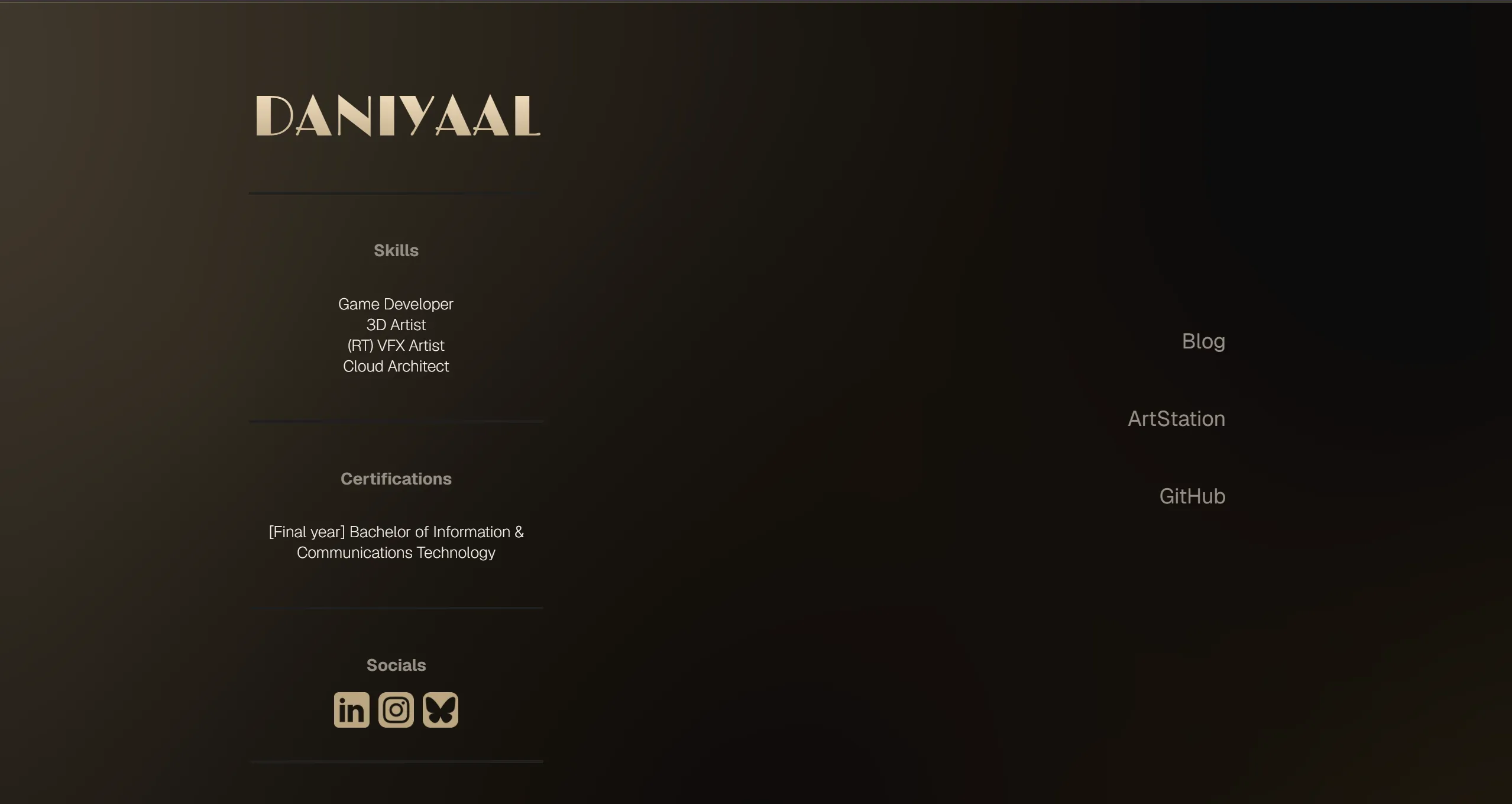
The second design removed the 3D model and replaced the lack of movement on the page with an animated mesh gradient by animating numerous radial gradients in CSS. This made the site too slow on low-end devices (especially when hardware acceleration was disabled in browsers) and there was banding due to the dark colours which was difficult to reduce, even with a noise texture applied to smoothen the transitions.
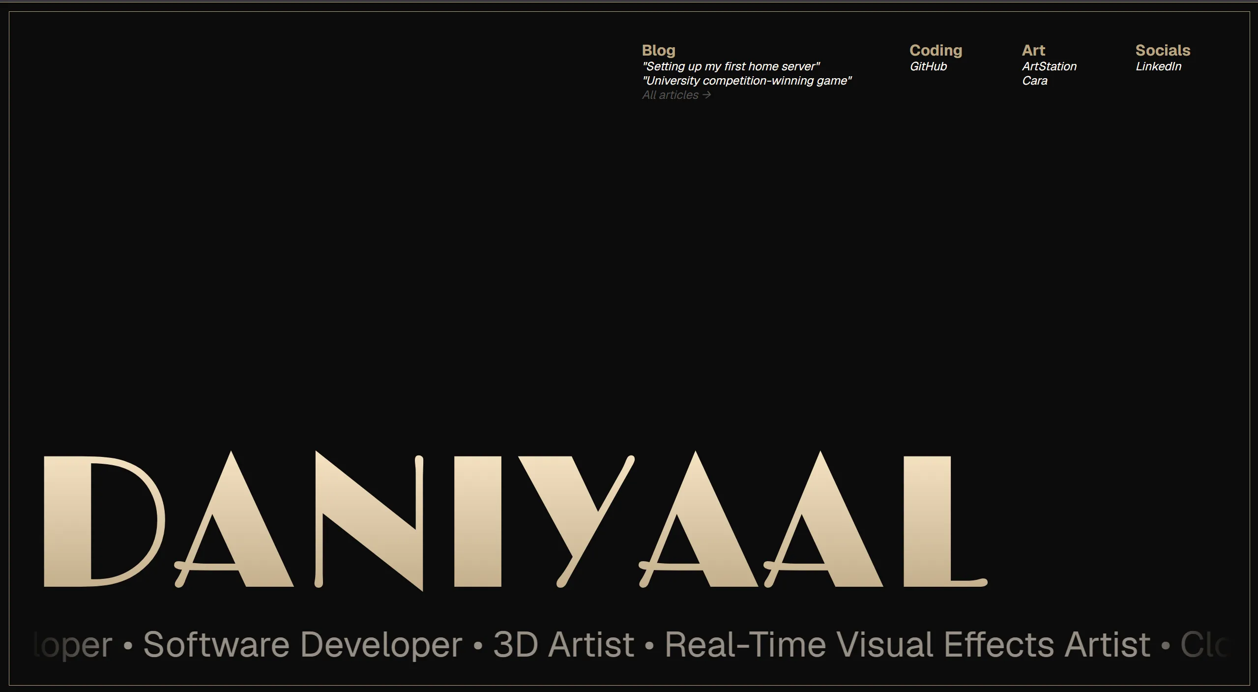
The third design removed the column-based approach of earlier designs and instead made text itself stand out. The scrolling LED sign from the first design came back as a simpler scrolling text to display my skills and a downside of earlier designs was resolved which was that there were not enough links by adding an expanded navigation section.
Deployment
The website is deployed on Vercel's free plan with the SSL/TLS certificate also from Vercel. Deployment is an automated process through GitLab using a CI/CD script which automatically tests then builds and deploys the website to Vercel when code enters the main branch. Once deployed, the website is automatically accessible at the URL served over HTTPS. The domain is registered with Porkbun and points to Vercel's nameservers for Vercel's SSL/TLS certificate.
Future Improvements
The current implementation meets my requirements but I could improve the website by implementing more component types for the article page so that different elements can be separated such as for emphasis. Additionally, an article editor would help make the website easier to edit but it would need to be carefully constructed to ensure it has all of the features that I use when writing articles directly in HTML/CSS.